 |
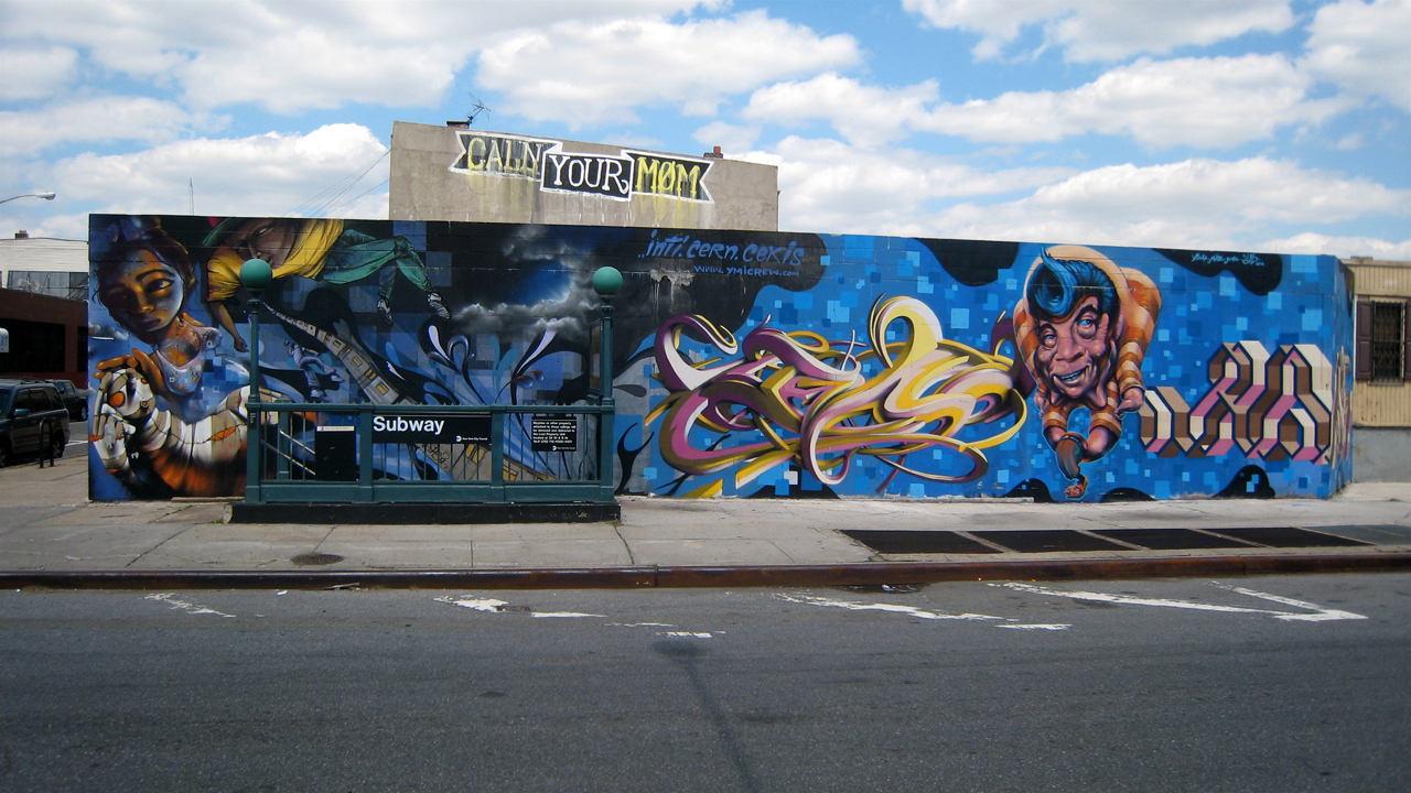
| The style of this is fluid and haunting. I can't tell which side is better the left or right. And then there's the colors, Striking without being to flashy. |

 |
| How anyone can use spray-paint to do things like this is beyond me. |
 |
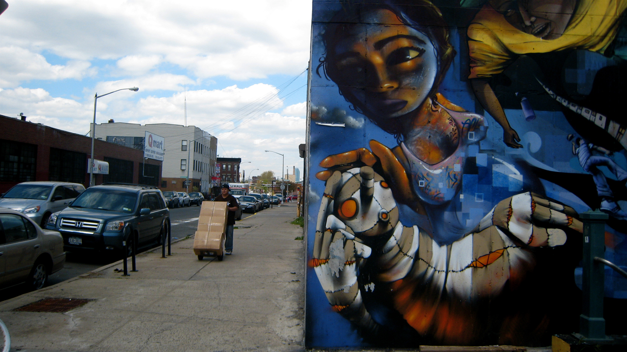
| The girl is petting that "creature" but yet shes looking away as if something distracted her. The guy seems like he's a symbol of the outside world, just over her shoulder. |


 |
| I love the industrial feel of the area. There's a feeling of open space and something out the "City". |

 |
| The color combination, matched with the fluidity of the line work and undulating curves, is awesome. |

 |
| This one has a cool 2d-3d effect, the colors are in almost sharp contrast to each other. The linear curved, geometric style is hot. |

 |
| This one has an electric feel, like the letters are radiating with the power of lighting. |
 |
| Break on through to the other side. |

 |
| The color of the lettering is bright and should over-power the figures, but the style of the figures keeps the balance . |

 |
| This one has a real kooky, modern funny sense to the illustration. With the girl and the shark, its like a metaphor for the world. |

 |
| The curves, colors, and contrasting visual sense has a calm feeling to it. |
 |
| It makes me think of metal, of trains. |

 |
| The color coordination and 3 dimensional space of the line work is amazing. |
No comments:
Post a Comment